When choosing colours for your House, it is best that you make the decision instead of trusting someone else because you will be the ones who eat and sleep, entertain, play and rejuvenate in the spaces.
Since there are hundreds of options in paint colours, it may seem to be a difficult task. But just as you coordinate colours everyday in what you wear, you can choose colours of your choice for your rooms. For that, an understanding of colour and the 'Colour Wheel' is necessary.
The colours are divided into three basic categories. They are:
USE THE COLOUR WHEEL TO DECIDE A COLOUR SCHEME:
Since there are hundreds of options in paint colours, it may seem to be a difficult task. But just as you coordinate colours everyday in what you wear, you can choose colours of your choice for your rooms. For that, an understanding of colour and the 'Colour Wheel' is necessary.
THE COLOUR CATEGORIES:
The colours are divided into three basic categories. They are:
- Primary colours- These are the three basic colours, red, blue and yellow. They are the foundation of the colour wheel and all other colours are derived from them.
- Secondary colours- When two primary colours are mixed, they form a secondary colour. They are orange, green and violet.
- Tertiary colours- When two secondary colours are mixed, they form a tertiary colour, like citron, olive, russet.
THE COLOR WHEEL:
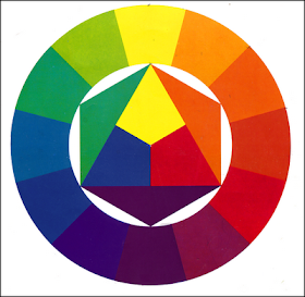
The colour wheel or colour circle is an abstract illustrative organization of colour hues around a circle, showing relationships between colours considered to be primary colours, secondary colours, complementary colours, etc. The colour wheel shows how each colour of the spectrum relates to every other; starting from dark (at the center) and spreading out to light (at the perimeter). The colour wheel is a complete picture of all the available colours.
In the colour wheel the primaries form a triangle with equal sides within the circle, and the secondaries form another triangle opposite to that. Each colour has a ‘complement’ which is located directly across from it on the wheel. Thus, green is the complement of red, orange is the complement of blue etc.
USE THE COLOUR WHEEL TO DECIDE A COLOUR SCHEME:
You can use the Colour Wheel to help decide the colour scheme.You can choose from these basic types of colour schemes.
- Monochromatic: Where one colour is dominant, and tints and shades of this colour are used to create combinations.
An example of monochromatic colour in different shades and tints.
- Complementary: Where colours that are diametrically opposite on the wheel are used in combinations.
- Combine or Contrast: Combining, or contrasting colours can give an interior its individuality, a personality of its own. For example, combine white with beige – the result is glowing sophistication. Contrast red or black with white – the result is stark, bright and stylish.
- Analogous: Where colours that are adjacent or at least close to one and other on the Colour Wheel are used to create combinations.
An example of analogous colours
- Tinting, Toning or Graying: Interior designers often compensate for intensity by either tinting (adding white) or toning (adding black) or by graying (adding complementary colorus). In these ways they create contrast through a change in value (lightness and darkness) or intensity (brightness and dullness). Tints and tones create a total effect that is lively and pleasing but not overwhelming.
- Triadic: Where a set of three colours more or less equidistant on the wheel are used in combination.
An example of triadic colours used in art.


No comments:
Post a Comment
Thank you for leaving a comment. Will get back to you soon.